Published on: July 2, 2025
On iOS 26 we have lots of new ways to reimagine our UIs with Liquid Glass. This means that we can take a look at Apple’s built-in applications and find interesting applications of Liquid Glass that we can use to enhance our understanding of how Liquid Glass components can be built, and to understand what Apple considers to be good practice for Liquid Glass interfaces.
In this post, we’re going to replicate a control that’s part of the new maps app.
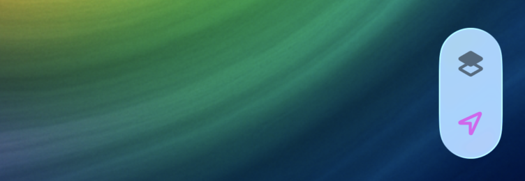
It’s a vertical stack of two buttons in a single Liquid Glass container. Here’s what the component looks like in iOS 26:

And here’s the component that we’ll build in this post:

We’re going to be making use of buttons, button styles, a GlassEffectContainer, and the glassEffectUnion view modifier to achieve our effect.
Building the component’s buttons
We’ll start off with a GlassEffectContainer and a VStack that contains two buttons:
GlassEffectContainer {
    VStack {
        Button {

        } label: {
            Label("Locations", systemImage: "square.2.layers.3d.top.filled")
                .bold()
                .labelStyle(.iconOnly)
                .foregroundStyle(Color.black.secondary)
        }
        .buttonStyle(.glass)

        Button {

        } label: {
            Label("Navigation", systemImage: "location")
                .bold()
                .labelStyle(.iconOnly)
                .foregroundStyle(Color.purple)
        }
        .buttonStyle(.glass)
    }
}
This code will simply create two buttons on top of each other using a glass button style. The resulting UI looks like this:

That’s not great but it’s a start. We need to apply a different buttonStyle and tint our glass to have a white background. The code below shows how to do that. For brevity, I will only show a single button; the buttonStyle should be applied to both of our buttons though:
GlassEffectContainer {
    VStack {
        // ...

        Button {

        } label: {
            Label("Navigation", systemImage: "location")
                .bold()
                .labelStyle(.iconOnly)
                .foregroundStyle(Color.purple)
        }
        .buttonStyle(.glassProminent)
    }.tint(.white.opacity(0.8))
}
With this code, both buttons have a prominent style which gives them a background color instead of being fully translucent like they are with the normal glass effect:

Now that we have our buttons set up, what we need to do is group them together into a single glass shape. To do this, we use the glassEffectUnion view modifier on both elements that we want to group.
Let’s go ahead and do that next.
Grouping elements using a glassEffectUnion
A glassEffectUnion can be used to have multiple buttons contribute to a single Liquid Glass shape. In our case, we want these two buttons to be treated as a single Liquid Glass shape so they end up looking similar to the Apple Maps components we’re trying to replicate.
First, we need to add a namespace to our container view:
@Namespace var unionNamespaceWe’ll use this namespace as a way to connect our elements.
Next, we need to update our buttons:
GlassEffectContainer {
    VStack {
        Button {

        } label: {
            Label("Locations", systemImage: "square.2.layers.3d.top.filled")
                .bold()
                .labelStyle(.iconOnly)
                .foregroundStyle(Color.black.secondary)
        }
        .buttonStyle(.glassProminent)
        .glassEffectUnion(id: "mapOptions", namespace: unionNamespace)

        Button {

        } label: {
            Label("Navigation", systemImage: "location")
                .bold()
                .labelStyle(.iconOnly)
                .foregroundStyle(Color.purple)
        }
        .buttonStyle(.glassProminent)
        .glassEffectUnion(id: "mapOptions", namespace: unionNamespace)
    }.tint(Color.white.opacity(0.8))
}
By applying glassEffectUnion(id: "mapOptions", namespace: unionNamespace) to both views they become connected. There are a few conditions to make the grouping work though:
- The elements must have the same
idfor them to be grouped - The glass effect that’s used must be the same for all elements in the union or they won’t be grouped
-
All components in the group must be tinted the same way or they won’t be grouped
Now that our elements are grouped, they’re almost exactly where we want them to be:

The buttons are a bit close to the top and bottom edges so we should apply some padding to our Label components. I like the spacing in the middle, so what I’ll do is pad the top of the first Label and the bottom of the second one:
GlassEffectContainer {
    VStack {
        Button {

        } label: {
            Label("Locations", systemImage: "square.2.layers.3d.top.filled")
                .bold()
                .labelStyle(.iconOnly)
                .padding(.top, 8)
                .foregroundStyle(Color.black.secondary)
        }
        .buttonStyle(.glassProminent)
        .glassEffectUnion(id: "mapOptions", namespace: unionNamespace)

        Button {

        } label: {
            Label("Navigation", systemImage: "location")
                .bold()
                .labelStyle(.iconOnly)
                .padding(.bottom, 8)
                .foregroundStyle(Color.purple)
        }
        .buttonStyle(.glassProminent)
        .glassEffectUnion(id: "mapOptions", namespace: unionNamespace)
    }.tint(Color.white.opacity(0.8))
}
This completes our effect:

In Summary
On iOS 26, we have endless new possibilities to build interesting UI components with Liquid Glass. In this post, we tried copying a UI element from Apple’s Maps application to see how we can build a single Liquid Glass element that groups two vertically stacked buttons together.
We used a glassEffectUnion to link together two UI Components and make them appear as a single Liquid Glass shape.
You learned that this view modifier will group any Liquid Glass components that share the same glass style into a single shape. This means these components they will look and feel like a single unit.

